20+ Text and Background Color Combinations for Ecommerce and Social Media
 Abdullah Shahid
Using the right text and background color combinations can define your ecommerce website’s success. Colors affect how people read, feel, and take action on your store. The wrong combo can ruin usability, while the right one builds clarity, trust, and conversions.
Read our blog: What color attracts the most attention?
Why Color Combinations Matter in Web Design
Color affects how users perceive and interact with your content. High contrast ensures readability, while harmonious tones improve visual hierarchy. Most importantly, your color choices reflect your brand and influence buying decisions subconsciously.
According to a study by the Institute for Color Research, people form a subconscious opinion about a product within 90 seconds, and up to 90% of that assessment is based on color alone.
High-Contrast Combinations That Work Everywhere
These combinations are universal and work across industries:
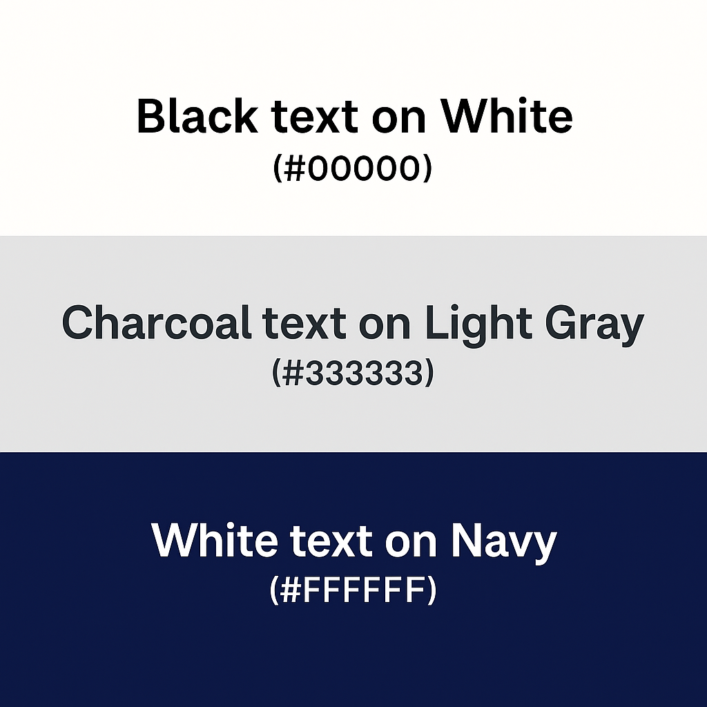
- Black on White (#000000 / #FFFFFF): The timeless choice for body content, blogs, and product descriptions.
- Charcoal on Light Gray (#333333 / #F5F5F5): Professional, easier on the eyes than pure black, ideal for tech and SaaS.
- White on Navy (#FFFFFF / #1A1A40): Great for headers, footers, or dark-themed sections.
These pairs perform well for primary content and maximize accessibility and compliance with WCAG 2.1 guidelines.
Best Color Combinations for Ecommerce Landing Pages
Landing pages need to convert, so focus on combinations that grab attention while keeping it clean:
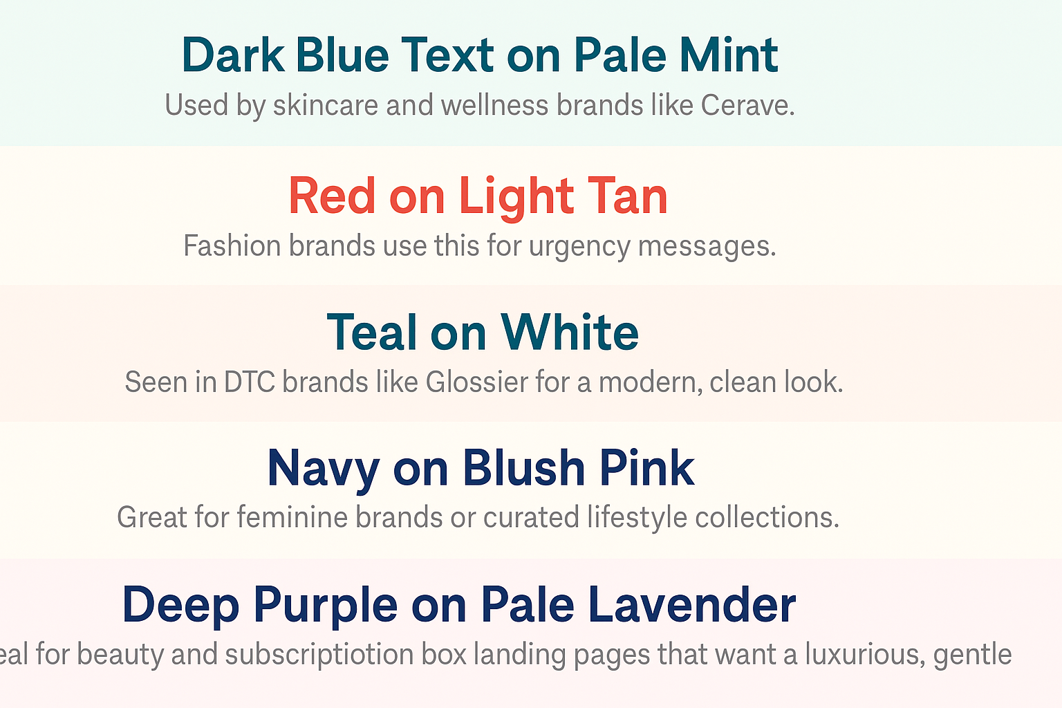
- Dark Blue Text on Pale Mint (#1C3F60 / #E9F7F6): Used by skincare and wellness brands like Cerave.
- Red on Light Tan (#FF4D4F / #FFF3E0): Fashion brands use this for urgency messages.
- Teal on White (#00C4CC / #FFFFFF): Seen in DTC brands like Glossier for a modern, clean look.
- Navy on Blush Pink (#1C3F60 / #FFE4E1): Great for feminine brands or curated lifestyle collections.
- Deep Purple on Pale Lavender (#5E548E / #F3EFFE): Ideal for beauty and subscription box landing pages that want a luxurious, gentle aesthetic.
Use these combinations on testimonials, feature highlights, or promo banners.
Social Media Background and Text Color Combinations That Convert
For social content like carousels, ads, and Reels covers:
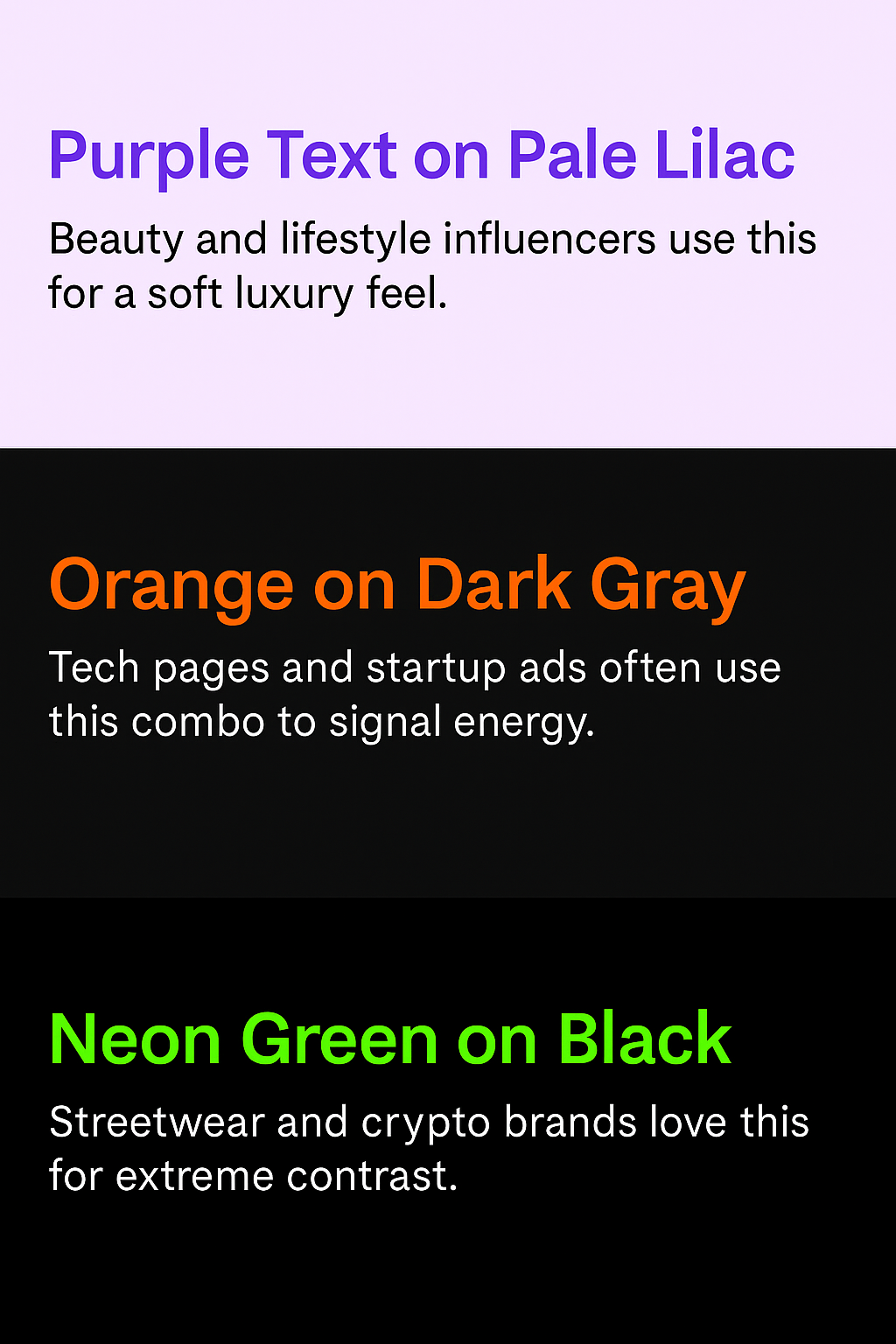
- Purple Text on Pale Lilac (#7950F2 / #F4EDFF): Beauty and lifestyle influencers use this for a soft luxury feel.
- Orange on Dark Gray (#FF9800 / #212121): Tech pages and startup ads often use this combo to signal energy.
- Neon Green on Black (#39FF14 / #000000): Streetwear and crypto brands love this for extreme contrast.
These color combinations work well in image overlays, text-based stories, or Instagram reels when paired with bold typography.
Soft Background Color Combinations for Ecommerce Stores
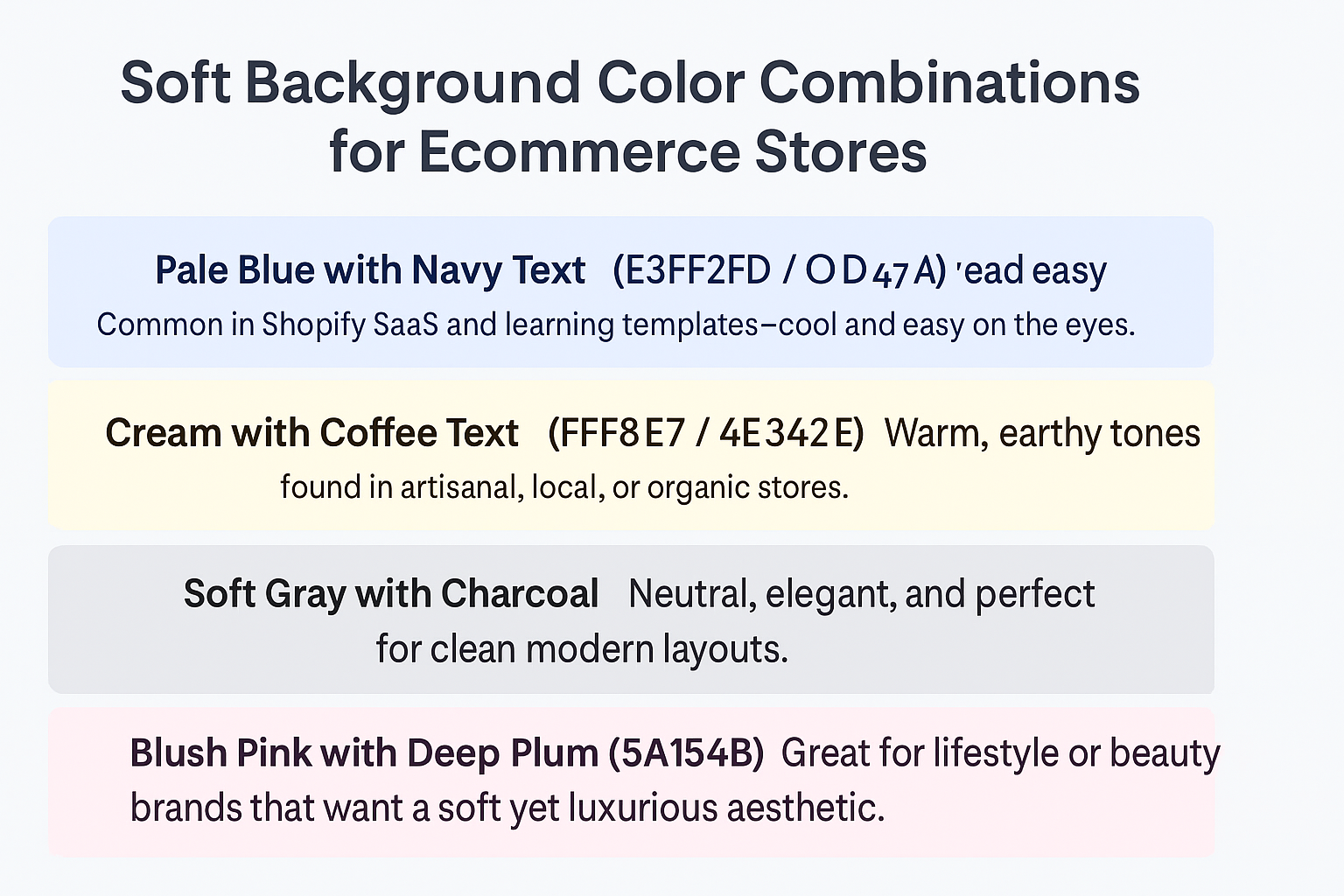
Subtle background shades help maintain a clean, calming visual flow and pair beautifully with darker text. These combinations are ideal for wellness, handmade, or minimalist brands.
- Pale Blue with Navy Text (#E3F2FD / #0D47A1): Common in Shopify SaaS and learning templates—cool and easy on the eyes.
- Cream with Coffee Text (#FFF8E7 / #4E342E): Warm, earthy tones found in artisanal, local, or organic stores.
- Soft Gray with Charcoal (#F2F2F2 / #333333): Neutral, elegant, and perfect for clean modern layouts.
- Blush Pink with Deep Plum Text (#FBE4E6 / #4A154B): Great for lifestyle or beauty brands that want a soft yet luxurious aesthetic.
- Mint Green with Slate Text (#E0F7F1 / #37474F): Works well for eco-friendly product pages and calming product experiences.
These keep your layout content-focused while giving your site personality.
Combinations for Bold Accent Backgrounds with White Text
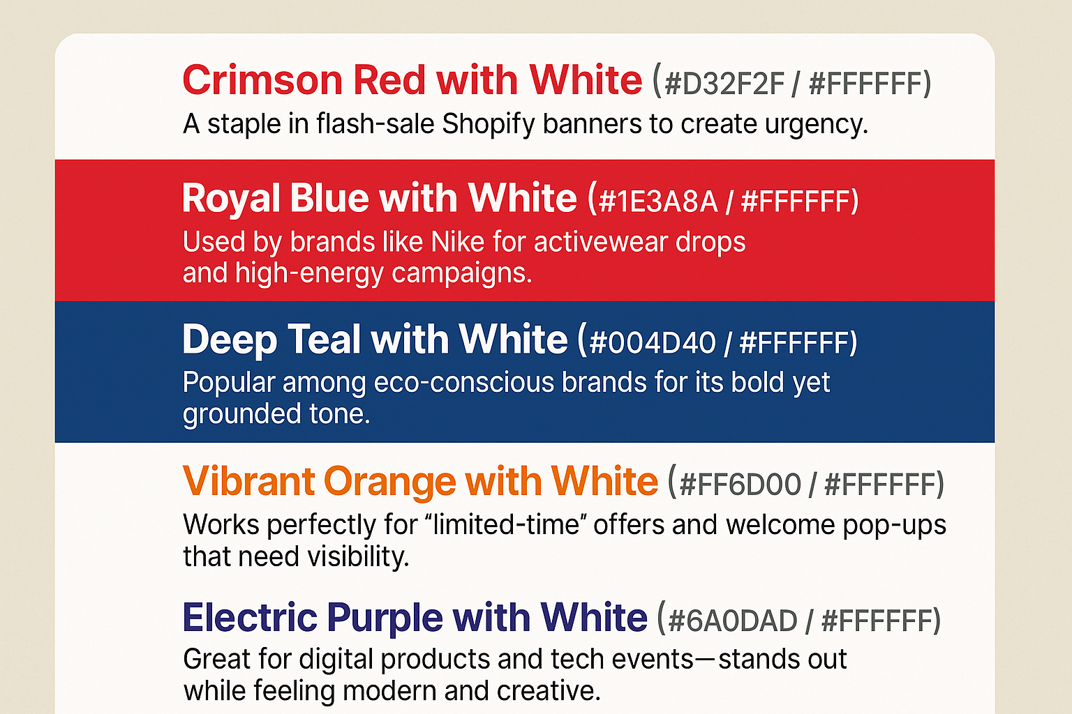
Accent sections like banners, hero headers, and flash-sale alerts benefit from vivid background colors paired with white text. These combinations command attention and drive action:
- Crimson Red with White (#D32F2F / #FFFFFF): A staple in flash-sale Shopify banners to create urgency.
- Royal Blue with White (#1E3A8A / #FFFFFF): Used by brands like Nike for activewear drops and high-energy campaigns.
- Deep Teal with White (#004D40 / #FFFFFF): Popular among eco-conscious brands for its bold yet grounded tone.
- Vibrant Orange with White (#FF6D00 / #FFFFFF): Works perfectly for “limited-time” offers and welcome pop-ups that need visibility.
- Electric Purple with White (#6A0DAD / #FFFFFF): Great for digital products and tech events—stands out while feeling modern and creative.
Use these combinations in CTAs, headers, or overlays where clarity and impact matter most.
Gradient Color Combinations for Ecommerce Websites
Gradients are everywhere—from Canva designs to Shopify banners. But readability can suffer if poorly done.
Tips for gradients:
- Overlay gradients with a semi-transparent dark layer.
- Use white or bold black text with subtle shadows.
- Ensure consistent contrast across screen sizes.
Examples:
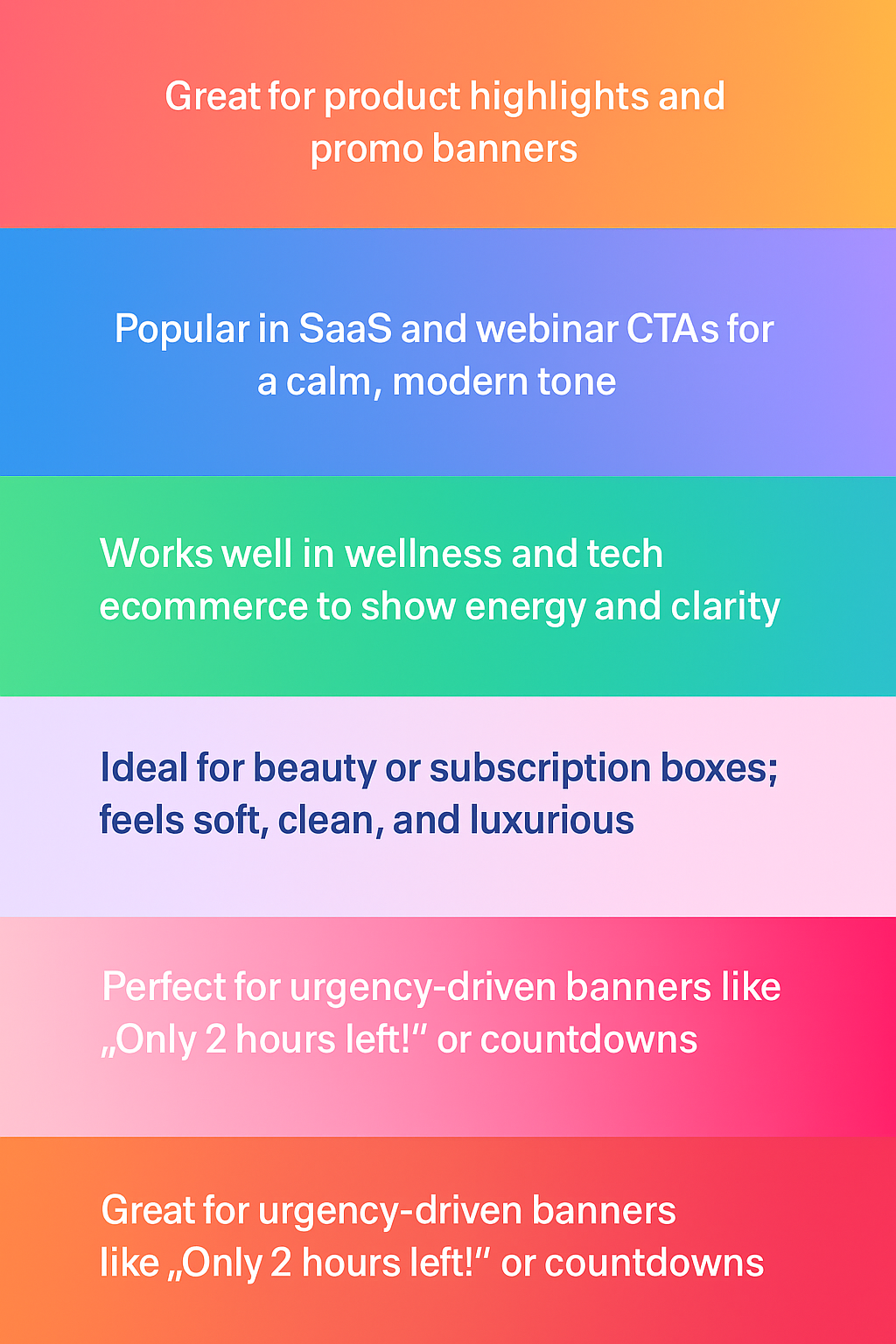
- Pink-to-Orange Gradient (#FF6F91 → #FFC75F) with white text: Great for product highlights and promo banners.
- Blue-to-Purple Gradient (#2193B0 → #6DD5ED): Popular in SaaS and webinar CTAs for a calm, modern tone.
- Teal-to-Lime Gradient (#00C4CC → #A3FF00): Works well in wellness and tech ecommerce to show energy and clarity.
- Lavender-to-Blush Gradient (#D7C2F1 → #FCE1E4): Ideal for beauty or subscription boxes; feels soft, clean, and luxurious.
- Orange-to-Red Gradient (#FFA726 → #EF5350): Perfect for urgency-driven banners like “Only 2 hours left!” or countdowns.
Test gradients across desktop and mobile to ensure readability holds up under different lighting and screen modes.
Text and Background Color Combinations That Build Trust
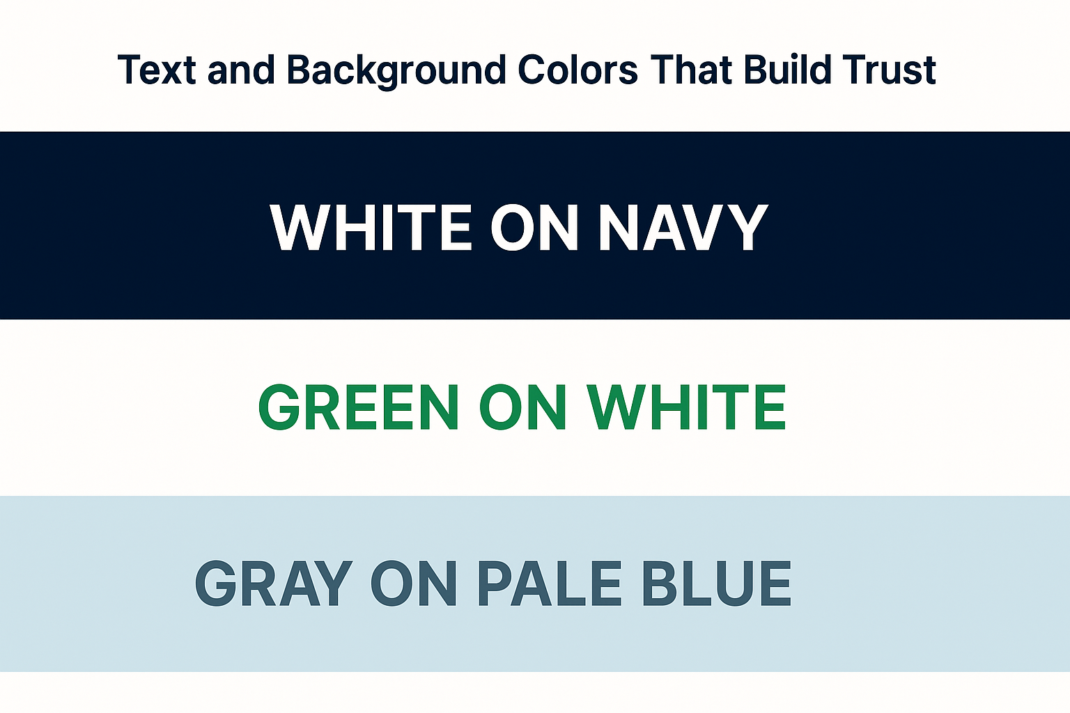
Certain combinations are used repeatedly across high-conversion sites to signal reliability:
- White on Navy (#FFFFFF / #1A1A40): Creates authority; perfect for guarantee badges.
- Green on White (#4CAF50 / #FFFFFF): Signals eco-friendliness or payment security.
- Gray on Pale Blue (#757575 / #E3F2FD): Neutral and informational; good for return policies.
Trust colors should be used sparingly—but purposefully—on policies, FAQs, and social proof widgets.
Embed Insta, TikTok, YT & More on Shopify Using EmbedAny

Designing in theory is one thing, seeing how content looks live is another. Tools like EmbedAny let you embed social content, reviews, and product feeds from over 800+ platforms right into your Shopify pages.
You can test:
- Instagram posts with bold background layouts.
- TikTok videos with dark overlays.
- Google Review cards with brand-colored borders.
This allows you to test text visibility, alignment, and overall visual balance before pushing a layout live.
Read our blog: How to embed Instagram feed to Shopify
Final Thoughts on Text and Background Color Combinations
The best text and background color combinations improve clarity, guide user flow, and enhance your Shopify store’s design. From landing pages to social embeds, choose color pairs that reflect your brand while maintaining contrast and accessibility.
Use tools like EmbedAny to test layouts with real, embedded content before going live—ensuring every section looks as good as it converts.