What Color Attracts the Most Attention in E-commerce & Advertising | Best Color Combinations for Ecommerce
 Abdullah Shahid
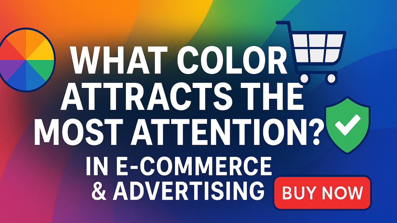
Color isn’t just decoration. It guides the eye, sets mood, and nudges shoppers toward the “Add to cart” button. Below is a quick, research-backed tour of the colors that grab the most attention in ads, websites, and product pages. Lets find out attention grabbing color combinations for ecommerce and advertising industry.
Why color matters in online shopping
- 90% of a first impression comes from color alone.
- Red-based ads often out-click blue ones for impulse products.
- Changing a CTA button from gray to red or green can lift conversions by double digits.
Short takeaway: pick colors that fit your brand but still pop against your theme.
Attention-Grabbing Colors for Ads
Here are some great colors that will attract the most attention for your digital ads and ecommerce websites and campaigns.
Red / Crimson – Urgency & Excitement

- Flash-sale headers, limited-time banners, countdown bars
- “Ends Tonight” overlays on social ads
- Abandoned-cart emails where a bold button must scream “Checkout Now”
Orange – Action & Warmth

- Primary “Add to Cart” or “Book Now” buttons that must be unmistakable
- Free-shipping pop-ups and upsell bars that need a friendly nudge
- Seasonal promos (Halloween, autumn deals) where earthy orange feels on-theme
Yellow – Curiosity & Optimism

- “New Arrival” badges or price-drop stickers that should pop on any background
- Highlight strips under key features (“Best Seller,” “Staff Pick”)
- Exit-intent overlays inviting subscribers to spin-the-wheel discounts
Green – Trust & Growth
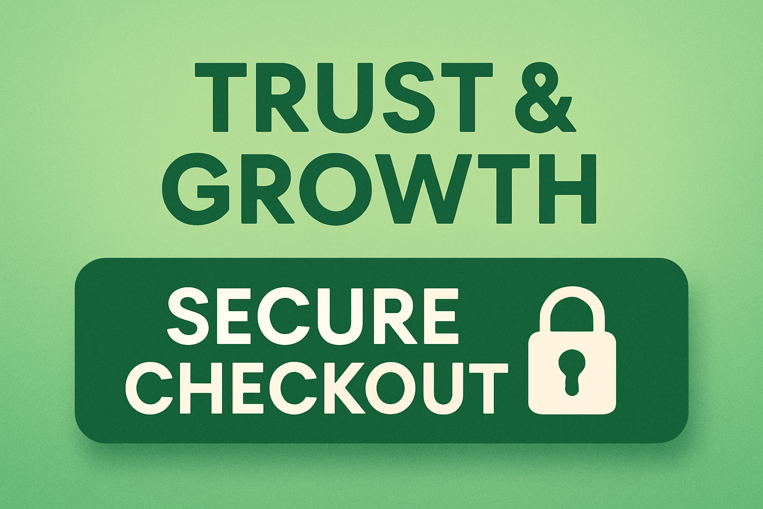
- Secure-checkout buttons (“Pay Now”) and money-back guarantees
- Eco or wellness product tags (“Vegan,” “Carbon-Neutral”)
- Success states in forms and quiz results (“Match Found!”)
Deep Blue / Navy – Reliability & Calm

- High-ticket product pages (electronics, finance, SaaS) that require authority
- Loyalty-program banners promising long-term value
- Footer blocks with contact info or trust badges
Purple / Violet – Luxury & Creativity

- Limited-edition drops, beauty boxes, and subscription reveals
- “Refer-a-Friend” widgets where exclusivity matters
- Webinar or course signup CTAs targeting a creative audience
Black on Neon Accent – High Contrast for Streetwear & Tech
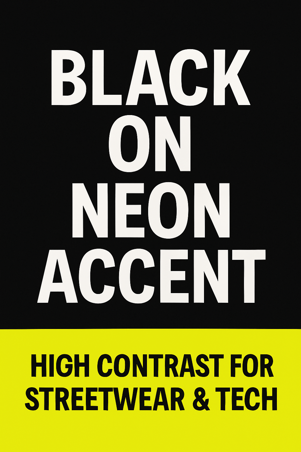
- Showcase sliders where product shots sit on a dark stage
- Limited-run sneaker launches with neon “Buy Now” chips
- Event countdown bars (concerts, gaming drops)
Pro tip: pick one high-contrast accent per campaign; contrast drives clicks more than the exact hue.
Eye-Catching Color Combinations for an E-commerce Website
Warm Accent on a Neutral Base
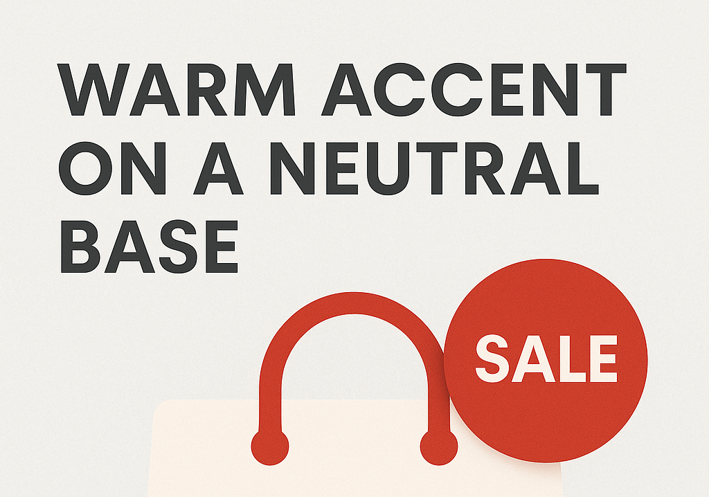
Palette: #FFFFFF (white) / #F8F8F8 (light gray) + #FF4D4F (red)
Use it for: fashion or electronics stores running frequent flash sales—red badges jump off the pale canvas without exhausting shoppers.
Charcoal Monochrome with One Signal Color
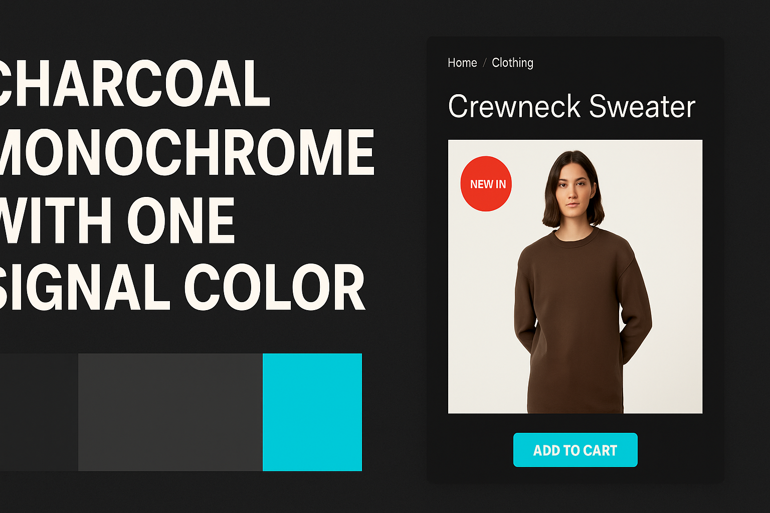
Palette: #1A1A1A (charcoal) / #333333 (slate) + #00C4CC (teal)
Use it for: luxury tech and DTC brands; teal CTAs guide the eye, while the dark base feels premium.
Coastal Wellness Tones
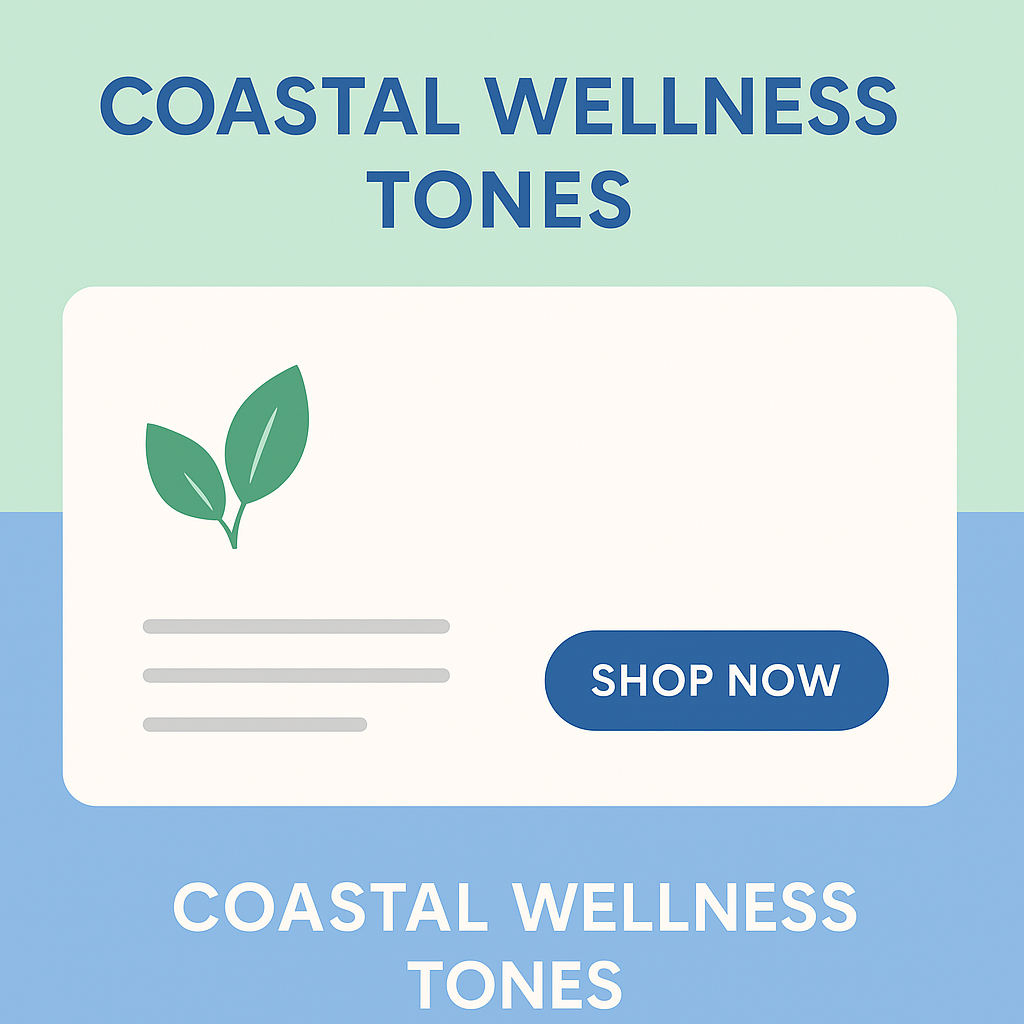
Palette: #E6F4EA (mint) / #B5D8FF (sky) + #2B6CB0 (deep sea blue)
Use it for: supplements, yoga gear, or eco-beauty—soft hues convey calm and sustainability.
Bold Duo: Black & Sunshine Yellow
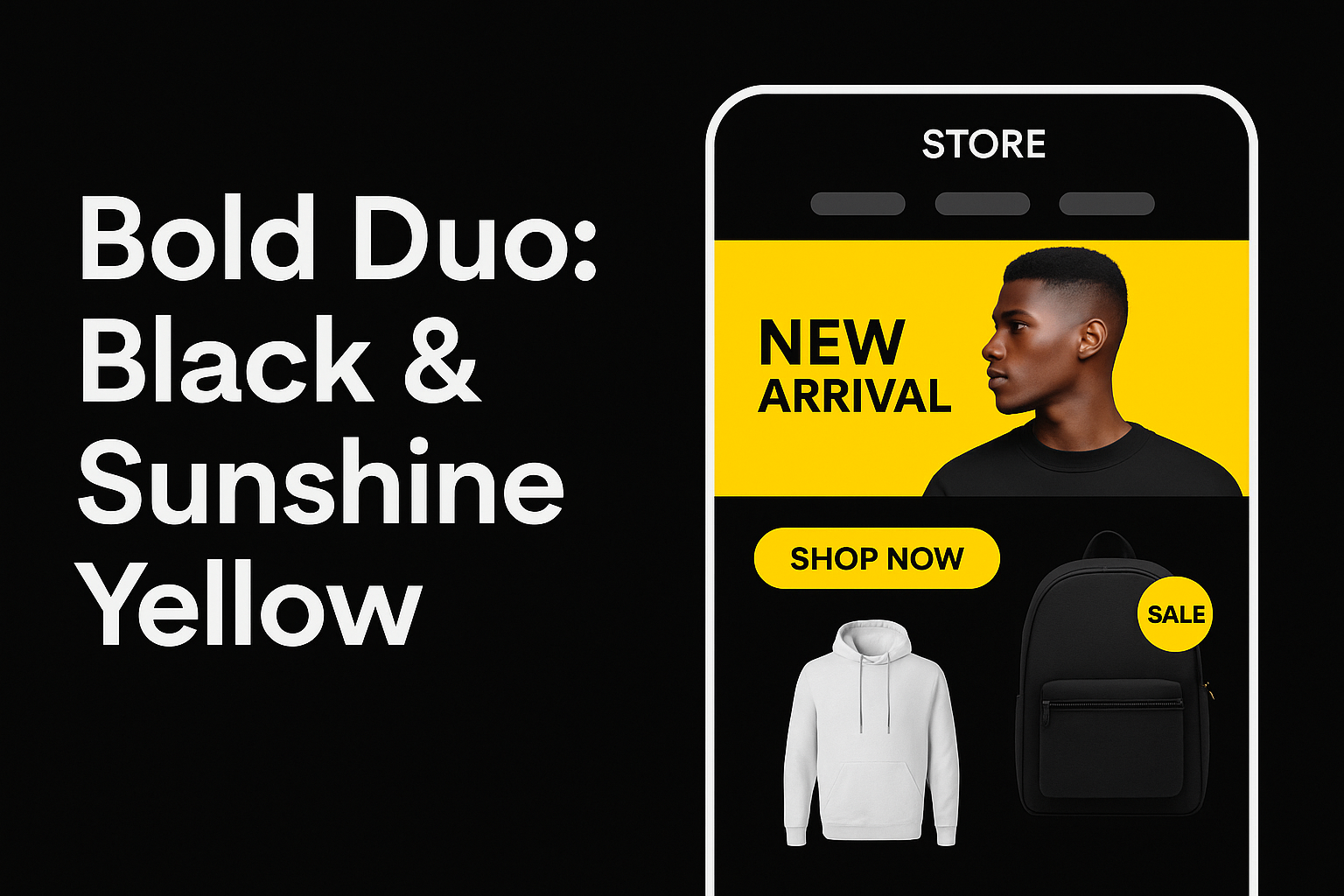
Palette: #000000 (black) + #FFC700 (yellow)
Use it for: streetwear and edgy accessories; yellow buttons and badges explode against black, increasing click-through on CTAs.
Pastel Gradient Over White
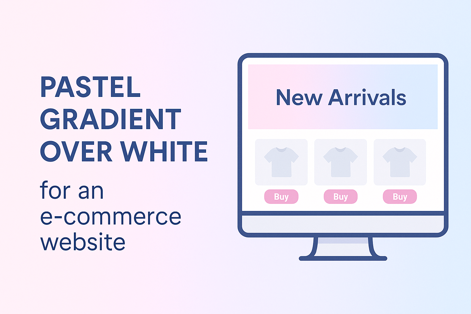
Palette: gradient #FFB6F9 → #9BE7FF
Use it for: children’s products, stationery, or feminine niches—gradient hero banners feel playful and on-trend.
Try swapping just your CTA color first, then roll the winning combo across banners, badges, and EmbedAny widgets to keep visual identity tight. Find some really cool Canva templates for Shopify here!
Where to Place Attention Grabbing Colors For Maximum Impact
- Hero banner – Use the loudest accent here; it frames every scroll.
- CTA buttons – Stick to one signal color site-wide.
- Urgency strips – A red countdown bar signals scarcity.
- Social-proof widgets – Highlight star ratings with gold or yellow.
Quick Color Experiments with EmbedAny
Color tweaks mean nothing if you can’t deploy assets fast. EmbedAny lets you paste a single link and drop live widgets—Instagram posts, TikTok demos, TrustPilot review cards—into any Shopify section. Use it to test color-led content in minutes:
1. Colored Reels beside products
Paste a bright, on-brand Instagram Reel; EmbedAny auto-renders it next to images to add motion and color pop.
2. Review badges in the brand hue
Grab your Google Reviews share link; EmbedAny outputs a widget you can tint with your primary color for seamless trust cues.
3. Multi-column grids
Need a bold collage for a sale? Paste links to five red-accented posts; choose the grid layout in EmbedAny and drop it on the home page.
4. Seasonal palette swaps—no redeploy
Running a green Earth-Day promo? Swap in green-heavy UGC links and watch the page update live—no theme edits, no new apps.
How to pick your attention color for Ecommerce?
- Check brand personality – Bold tech? Go neon. Luxury? Think rich jewel tones.
- Audit your theme background – Dark themes love bright oranges; light themes pop with deep blues.
- Run A/B tests – Use two EmbedAny sections with different-colored assets; track click-through on CTA buttons beneath.
- Stay accessible – Ensure at least 4.5:1 contrast for text and buttons.
Key takeaways
- Red, orange, and yellow pull eyes first; blue and green reassure.
- Contrast, placement, and consistency beat “favorite” colors.
- EmbedAny lets you deploy color-rich social proof in seconds—no code, 800+ platforms, unlimited layouts.
Ready to make color work harder?
Install EmbedAny, paste your most vibrant links, and watch attention—and conversions—follow.