Most Attention-Grabbing Colors in Advertising: How Color Psychology Drives Conversions?
 Abdullah Shahid
Color is not just decoration in marketing. It is a strategy. The most attention-grabbing colors in advertising can influence buying decisions, shape brand perception, and increase conversions within seconds. In this guide, we break down how color psychology influences consumer behavior, why certain colors perform better in ads, and how brands use color intentionally to capture attention and drive action.
The Psychology of Color in Advertising
 Color plays a pivotal role in the world of advertising. It’s not just an aesthetic choice; it’s a powerful tool that can evoke emotions, influence perceptions, and drive consumer behavior. The psychology of color examines how different hues can impact our thoughts and feelings. This field of study is paramount for advertisers who aim to craft compelling messages that resonate with their target audience.
Colors can convey a wide range of emotions and messages. For instance, red is often associated with excitement, passion, and urgency, making it a popular choice in sales and clearance advertising. Blue, on the other hand, is linked to trust, reliability, and calmness, which is why it’s frequently used by financial institutions and healthcare providers. Understanding these associations can help advertisers choose the right colors to evoke the desired response from their audience.
Moreover, color psychology is deeply intertwined with cultural and social contexts. Different cultures may perceive colors differently, and these perceptions can change over time. For example, while white is often associated with purity and weddings in Western cultures, it symbolizes mourning in some Eastern cultures. Advertisers must consider these cultural nuances to ensure their color choices are appropriate and effective.
How Colors Influence Consumer Behavior
 The influence of color on consumer behavior is both profound and multifaceted. Colors can capture attention, convey messages, and even drive purchasing decisions. In fact, studies have shown that up to 90% of snap judgments made about products can be based on color alone. This underscores the importance of selecting the right colors in advertising.
Different colors can evoke different psychological responses. For example, red can create a sense of urgency, which is why it’s often used in clearance sales. Yellow can evoke feelings of happiness and optimism, making it a great choice for brands that want to appear cheerful and approachable. Conversely, black can convey sophistication and luxury, which is why it’s commonly used by high-end brands.
Color can also enhance brand recognition. Consistent use of a specific color palette can help consumers quickly identify a brand, even without seeing its logo. For instance, the distinctive red and white of Coca-Cola or the blue and yellow of IKEA are instantly recognizable. This consistency not only aids in brand recall but also reinforces the brand’s identity and values.
The Most Effective Colors for Different Industries
 Different industries often favor specific colors to align with their brand messaging and consumer expectations. For instance, the fast-food industry frequently uses red and yellow in their branding. Red is known to stimulate appetite and create a sense of urgency, while yellow evokes happiness and friendliness. This combination is designed to attract customers quickly and encourage them to make impulsive decisions.
In contrast, the financial sector often prefers blue. Blue is associated with trust, dependability, and professionalism, making it an ideal choice for banks, insurance companies, and other financial institutions. The calming effect of blue can also help to reduce anxiety, which is particularly important in industries where consumers are making significant financial decisions.
The health and wellness industry typically leans towards green and white. Green is linked to health, growth, and tranquility, making it a popular choice for organic and natural products. White conveys purity, cleanliness, and simplicity, which is why it’s often used in healthcare settings. Together, these colors can create a sense of well-being and safety, which is crucial in the health industry.
Case Studies: Successful Brands and Their Color Choices
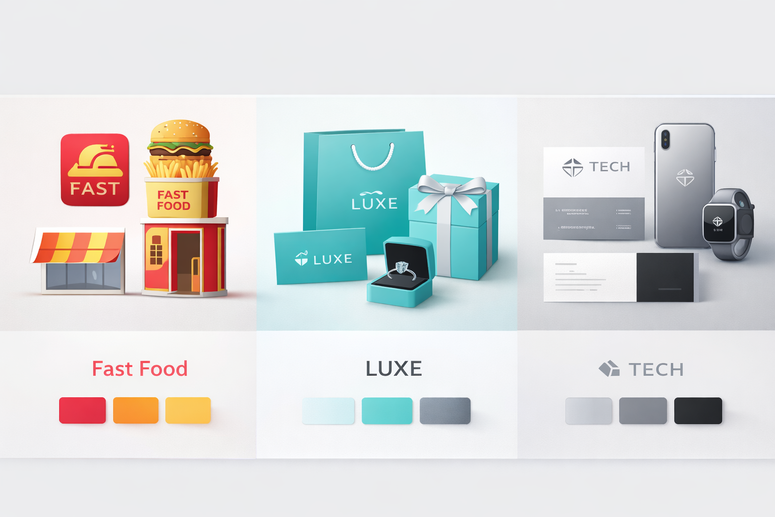 Examining the color choices of successful brands can provide valuable insights into effective advertising strategies. Take McDonald’s, for example. The fast-food giant’s use of red and yellow is no accident. Red stimulates hunger and excitement, while yellow is cheerful and attention-grabbing. This combination is designed to attract customers quickly and encourage them to make impulsive decisions.
Another notable example is Tiffany & Co. The luxury jewelry brand is synonymous with its signature shade of blue, known as Tiffany Blue. This distinctive color evokes feelings of elegance, exclusivity, and sophistication. By consistently using Tiffany Blue across all its branding, the company has created a strong, recognizable identity that sets it apart from competitors.
Apple is another brand that has effectively used color to its advantage. The company’s minimalist design and use of white and silver convey simplicity, innovation, and sophistication. These colors align perfectly with Apple’s brand message of cutting-edge technology and sleek, user-friendly design. The consistent use of this color palette has helped Apple build a strong, easily recognizable brand identity.
Cultural Significance of Colors in Advertising
 The cultural significance of colors is an essential consideration in global advertising. Colors can have different meanings and evoke different emotions in various cultures. For example, while red is associated with good luck and prosperity in China, it can signify danger or caution in Western cultures. Advertisers must be mindful of these cultural differences to avoid miscommunication and ensure their message is well received.
In India, the color yellow is associated with knowledge and learning, making it a suitable choice for educational institutions and products. In contrast, the same color might be associated with cowardice in some Western cultures. Understanding these nuances can help advertisers create more effective and culturally sensitive campaigns.
Moreover, colors can also have historical and religious significance. For instance, purple is often associated with royalty and luxury due to its historical use by nobility. In many Western cultures, white is associated with weddings and purity, while in some Eastern cultures, it is the color of mourning. Advertisers need to consider these associations when choosing colors for their campaigns to ensure they resonate with their target audience.
Tips for Choosing the Right Color Palette for Your Brand
 Choosing the right color palette for your brand is a critical decision that can significantly impact your brand’s perception and success. Here are some tips to help you make the right choice. First, consider the emotions and messages you want to convey. Different colors evoke different feelings and associations, so choose colors that align with your brand’s values and messaging.
Next, consider your target audience. Different demographics may respond differently to various colors. For instance, younger audiences may be drawn to bright, vibrant colors, while older audiences may prefer more subdued, classic hues. Understanding your audience’s preferences can help you choose colors that resonate with them.
Finally, consider your industry and competitors. Look at the color choices of successful brands in your industry and consider how you can differentiate yourself while still aligning with industry norms. Your goal should be to create a unique, recognizable color palette that sets you apart while still conveying the right message and emotions.
| Color | Emotions It Evokes | Best Used For | Industries That Use It | Marketing Tip |
|---|---|---|---|---|
| Red | Urgency, excitement, passion, action | Sales banners, clearance ads, CTA buttons | Ecommerce, food, retail, entertainment | Use for limited-time offers and flash sales |
| Blue | Trust, security, calm, reliability | Corporate branding, fintech, SaaS ads | Finance, tech, healthcare | Great for building credibility and long-term brand trust |
| Yellow | Optimism, energy, warmth | Highlight sections, promo labels | Retail, food, lifestyle brands | Use sparingly for attention without overwhelming |
| Green | Growth, health, balance, wealth | Eco-friendly campaigns, finance ads | Wellness, sustainability, banking | Works well for “save money” or organic messaging |
| Orange | Confidence, enthusiasm, affordability | CTA buttons, discount graphics | Ecommerce, startups, fitness | Strong alternative to red for action buttons |
| Purple | Luxury, creativity, imagination | Premium product ads, beauty campaigns | Beauty, fashion, high-end goods | Signals exclusivity and sophistication |
| Black | Power, elegance, authority | Luxury branding, minimalist campaigns | Fashion, automotive, tech | Ideal for high-ticket products |
| White | Simplicity, clarity, purity | Clean layouts, premium design | Tech, healthcare, lifestyle | Creates breathing space and modern appeal |
| Pink | Romance, softness, femininity | Valentine’s promotions, beauty ads | Fashion, cosmetics, gifting | Effective for emotional marketing campaigns |
| Gold | Prestige, wealth, exclusivity | Holiday campaigns, luxury ads | Jewelry, premium ecommerce | Use in moderation for high-end feel |
The Role of Color in Brand Identity and Recognition
Color plays a crucial role in brand identity and recognition. A consistent color palette can help create a strong, recognizable brand identity that sets you apart from competitors. When consumers see your brand’s colors, they should immediately think of your brand and the values it represents.
Moreover, color can enhance brand recall. Studies have shown that color can increase brand recognition by up to 80%. This means that a well-chosen color palette can help consumers remember your brand and distinguish it from others. This is particularly important in crowded markets where competition is fierce.
Finally, color can also influence brand perception. Different colors can convey different messages and emotions, helping to shape consumers’ perceptions of your brand. For instance, a brand that uses green might be perceived as environmentally friendly, while a brand that uses black might be seen as sophisticated and luxurious. By choosing the right colors, you can shape how consumers perceive your brand and create a strong, positive brand image.
Trends in Color Usage in Modern Advertising
Trends in color usage in advertising are constantly evolving as brands seek to stay relevant and resonate with their audiences. One notable trend is the use of bold, vibrant colors. These colors are attention-grabbing and can help brands stand out in crowded markets. Bright, saturated hues are particularly popular in digital advertising, where they can capture attention in a sea of content.
Another trend is the use of gradient colors. Gradients can add depth and dimension to designs, making them more visually appealing. This trend is particularly popular in tech and digital industries, where it can convey a sense of innovation and modernity. Gradients can also create a dynamic, energetic feel, which can be particularly effective in attracting younger audiences.
Finally, there is a growing trend towards using more natural, earthy colors. These colors are often associated with sustainability and wellness, making them a popular choice for brands in these industries. Earthy tones can convey a sense of authenticity and reliability, which can be particularly appealing in today’s market where consumers are increasingly seeking out brands that align with their values.
Tools and Resources for Color Selection
Choosing the right colors for your brand can be a challenging task, but there are many tools and resources available to help. One popular tool is Adobe Color, which allows you to create and explore color schemes. You can experiment with different color combinations and see how they work together. Adobe Color also offers a range of pre-made color palettes, which can be a great starting point if you’re unsure where to begin.
Another useful resource is the Pantone Color Institute, which provides a wealth of information on color trends and psychology. The Institute’s annual Color of the Year is widely regarded as a leading indicator of color trends. Pantone also offers a range of tools and resources to help you choose and implement the right colors for your brand.
Finally, there are many online resources and communities where you can seek inspiration and advice. Websites like Dribbble and Behance showcase the work of designers from around the world, providing a wealth of inspiration. Additionally, online communities like Reddit’s Color Theory subreddit offer a platform for discussing color choices and seeking feedback from other designers.
Frequently Asked Questions About Colors in Advertising
What color attracts the most attention in advertising?
Red is widely considered the most attention-grabbing color in advertising. It stimulates excitement, urgency, and strong emotional reactions, which is why it’s frequently used in clearance sales, limited-time offers, and promotional banners. Bright yellow is also highly visible and effective for catching attention, especially in outdoor or digital advertising where visibility is crucial.
What color increases sales the most?
There isn’t a single color that universally increases sales, but red and orange are commonly associated with higher conversions. Red creates urgency and impulse, while orange is often used for call-to-action buttons because it feels energetic and inviting. The most effective color depends on your industry, target audience, and overall brand identity. Testing different color variations (A/B testing) is the best way to determine what drives sales for your specific audience.
What is the most trustworthy color for brands?
Blue is generally regarded as the most trustworthy color for brands. It is associated with reliability, professionalism, and stability. That’s why many banks, tech companies, and healthcare institutions use blue in their branding. Darker shades of blue convey authority and dependability, while lighter shades can feel calm and approachable.
What is the best CTA button color?
The best CTA (Call-To-Action) button color is one that contrasts strongly with your website’s background and stands out clearly. Orange, red, and green are commonly used because they draw attention and signal action. However, contrast and visibility matter more than the specific color. A button that visually pops against your page design will typically perform better than one that blends in.
Do colors affect conversion rates?
Yes, colors can significantly affect conversion rates. Studies show that color influences consumer perception, brand recognition, and emotional response. A well-chosen color scheme can improve brand recall and increase engagement. However, conversion rates are influenced by multiple factors including design, messaging, usability, and audience preferences. Testing different color variations through controlled experiments is the most reliable way to measure impact.
Conclusion: Making Color Work for Your Advertising Strategy
In conclusion, color is a powerful tool in advertising that can significantly influence consumer behavior and brand perception. By understanding the psychology of color and how different hues can evoke different emotions and messages, you can make more informed choices in your advertising strategy.
Consider the specific colors that are most effective for your industry and target audience. Look to successful brands for inspiration and consider the cultural significance of colors in your target markets. By choosing the right color palette, you can create a strong, recognizable brand identity that resonates with your audience and sets you apart from competitors.
Finally, take advantage of the many tools and resources available to help you choose and implement the right colors for your brand. By making informed, strategic color choices, you can enhance your advertising strategy and create a lasting, positive impression on your audience. Remember, the right colors can capture attention, convey your brand message, and drive consumer behavior, making them a vital component of any successful advertising strategy.